





How to Create the Best Legal Website Design Without Losing Your Mind
What Makes the Best Legal Website Design in 2026?
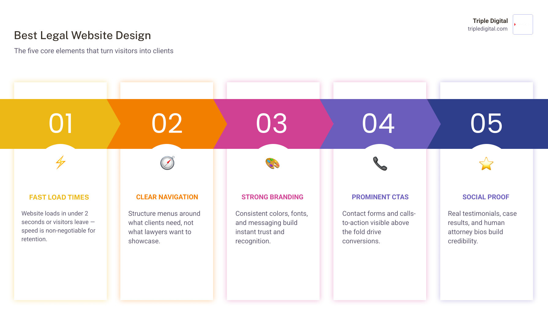
Best legal website design comes down to five core elements that turn visitors into clients:
- Fast load times — under 2 seconds, or visitors leave
- Clear navigation — structured around what clients need, not what lawyers want to show
- Strong branding — consistent colors, fonts, and messaging that build instant trust
- Prominent CTAs — contact forms and calls-to-action visible above the fold
- Social proof — real testimonials, case results, and attorney bios that feel human
Your law firm’s website is often the first — and sometimes only — chance you get to make an impression on a potential client.
And yet, most legal websites fall into the same trap: walls of legal jargon, generic stock photos, and contact forms buried at the bottom of the page. The result? Visitors leave. Leads dry up. Cases go to the competitor down the street.
The numbers tell a hard story. Only 30% of law firm websites clearly explain how to hire a lawyer. Just 14% provide any pricing information. And 73% of prospective clients say they wouldn’t recommend the firm they contacted — largely because of a poor online experience.
But here’s what’s also true: firms that invest in user-friendly, transparent website design see up to 52% more revenue.
This guide breaks down exactly what separates a forgettable legal website from one that consistently wins clients — with real-world examples, design principles, and actionable steps you can use right now.
Simple guide to best legal website design terms:
Core Elements of the Best Legal Website Design
At its core, a stellar legal website must do more than look pretty. It has to act as your firm’s hardest-working virtual employee. In 2026, the best legal website design is built on a foundation of clear brand identity, deep local roots, and core values that immediately resonate with your target audience.
Too many legal sites look exactly the same—marble pillars, scales of justice, and stern-faced attorneys crossing their arms. To stand out, your website must reflect who you actually are. If your firm is rooted in the local community, your design should visually tell that story. Incorporating local landmarks, community involvement photos, and a color palette that reflects your regional identity helps build an instant, subconscious bond with visitors.
When planning your layout, you need to think about the entire user experience (UX). This is where strategic planning comes in. If you want to understand the foundational steps of building an impactful site, check out our comprehensive guide on Web Design for Law Firms.
Balancing Credibility and Approachability in the Best Legal Website Design
One of the greatest challenges in legal web design is balancing professional authority with genuine, human approachability. When people look for a lawyer, they are often going through some of the most stressful moments of their lives. They do not want to be intimidated by cold, corporate layouts or buried under complex legal jargon. They want to feel heard, understood, and supported.
To achieve this balance, focus on humanizing your attorneys. Swap out generic stock photos for high-quality, professional, yet warm photography of your actual team. Show your lawyers interacting in the office, smiling, and looking accessible.
Your copy should lead with empathy. Instead of boasting about “owning the courtroom” right off the bat, explain why you practice law and how you help families or businesses navigate difficult times. By combining clean, modern visual structures with authentic, empathetic content, you position your firm as both highly capable and deeply caring. For more inspiration on how top firms pull this off, read our breakdown of the Best Websites for Law Firms.
Why Niche Specialization Drives the Best Legal Website Design
If you try to speak to everyone, you end up speaking to no one. Niche specialization is one of the most powerful drivers of high conversion rates on legal websites. When a user lands on your site, they should immediately know that you specialize in the exact issue they are facing.
For example, a boutique firm focusing solely on cycling accidents will convert prospective clients at a much higher rate if their entire design—from hero images of bikes to specialized resources—caters directly to the cycling community. This highly targeted approach reassures the visitor that you possess deep, specialized knowledge in their specific area of need.
Structuring your site around clear practice areas and tailored user paths ensures that visitors do not get lost in irrelevant information. To learn how to build a tailored digital space for your specific practice, explore the benefits of Custom Lawyer Web Design.
Designing for Diverse and Bilingual Client Bases
In highly diverse metropolitan hubs, designing a bilingual or multilingual website is no longer just a nice-to-have feature—it is a business necessity. If your local demographic includes a large Spanish-speaking population, your website must accommodate them seamlessly.
A simple, highly visible language toggle (such as an English/Español button in the main header) is the standard for modern accessibility. However, true localization goes beyond running your text through a basic translation tool. The translated content must feel natural, culturally respectful, and legally accurate.
Additionally, ensure your site meets modern accessibility standards (ADA compliance) so that users with visual, auditory, or motor limitations can easily navigate your pages, read your content, and submit inquiry forms without friction.
Award-Winning Inspiration: Real-World Legal Website Success Stories
Sometimes, the easiest way to figure out what you want is to look at what is already working beautifully. Award-winning legal websites in 2026 push the boundaries of traditional design, opting for bold visual choices, interactive elements, and absolute clarity.

Whether you are starting from scratch or planning a major overhaul, studying these successful sites can give you the creative spark you need. You can also browse through our own Portfolio to see how we bring high-performing, beautiful designs to life.
Creative Visuals and Award-Winning Aesthetics
To stand out in a crowded market, some firms use unexpected design themes to capture attention and win prestigious design accolades.
- Bick Law LLP: This environmental law firm famously secured a Webby Award nomination by ditching corporate clichés in favor of an animal-themed design paired with witty, memorable copy and elegant, color-fading animations.
- Hendler Flores Law: Awarded a Gold dotCOMM award, this site perfectly balances form and function, proving that sophisticated legal branding can be incredibly engaging.
- Steinberg Law Firm: Winning multiple awards like the W3 and Vega Awards, this site features over 1,000 pages of highly valuable content—including deep-dive analyses of specific local accidents—proving that massive educational resources can coexist with clean, beautiful design.
- Velkei Law: Recognized with a Vega Silver award, this site utilizes minimalist layouts, muted color palettes, and striking black-and-white photography to establish a sophisticated, modern, and highly professional online presence.
- Kauff McGuire Margolis: Earning an AVA Digital Gold Award, this site stands out for its exceptional visual appeal, intuitive navigation, and flawless mobile experience.
- Stacey-Ann Taylor Law: Earned a prestigious spot on the Top 10 List by Lawyerist, recognized for its approachable layout, modern color scheme, and client-first messaging.
High-Converting Layouts and Clear Fee Transparency
Beyond aesthetics, the best websites are built to convert traffic into real business. These real-world examples show how strategic layout choices drive explosive growth:
- Nicolet Law: This firm’s web traffic has exploded over the last few years, driven by a highly effective layout that features eight video testimonials from real clients, making trust-building the centerpiece of their homepage.
- Fuchsberg & Fuchsberg: By focusing heavily on strategic content optimization and an intuitive user journey, this firm has experienced exponential traffic growth, drawing in highly qualified leads organically.
- Rawlins Law: Operating in a highly competitive market, this firm’s top-tier SEO structure and clean, conversion-focused layout consistently secure top search rankings and a steady stream of new cases.
- Paceline Law: With a high click-through rate and superior conversion rates, this site proves that a clean, modern design with clear call-to-action buttons keeps users engaged from the second they land on the page.
- LawBike Motorcycle Injury Lawyers: To eliminate any potential friction or anxiety around costs, this firm displays their transparent fee structure directly at the top of the homepage, instantly answering one of the biggest questions prospective clients have.
- Sommers Schwartz: To make finding the right representation effortless, this site features an innovative attorney search engine, allowing users to quickly filter and connect with any of the firm’s 40+ attorneys.
Conversion Rate Optimization: Turning Clicks into Clients
Driving traffic to your website is only half the battle. If visitors land on your page and leave without contacting you, your marketing budget is going to waste. Conversion Rate Optimization (CRO) is the art and science of guiding those visitors to take action.

A high-performing legal website acts as a smooth, welcoming slide that leads a stressed user directly to a solution. To make sure your site is fully optimized to turn casual browsers into signed cases, explore our specialized Website Conversion Rate Optimization Services.
Structuring High-Performing Calls-to-Action and Forms
Your call-to-action (CTA) is the most critical element on your website. If a user has to hunt for a way to contact you, they will simply click the back button and visit a competitor.
To maximize conversions, place your primary CTA (usually a phone number and a simple contact button) in the top-right corner of your header, ensuring it remains visible above the fold on both desktop and mobile devices.
Avoid long, intimidating forms with dozens of fields. Stressed users do not want to fill out a detailed biography just to get a consultation. Instead, use short, multi-step forms that ask for basic information first (name, email, phone number) before guiding them through a simple, step-by-step process. To master the art of landing page design, read our guide on Landing Page Optimization 101: Tips to Turn Clicks Into Customers.
Leveraging Video Testimonials and Social Proof
Nothing builds trust faster than seeing and hearing from other people who were once in the exact same position. While written reviews are great, video testimonials are the gold standard for modern legal websites.
Seeing a real person speak about how your firm helped them through a difficult time creates an immediate emotional connection. Place these videos prominently on your homepage and dedicated testimonial pages. Pair them with clear, verifiable case results and media mentions to build an undeniable wall of social proof. For a deep dive into building a highly effective conversion funnel, check out our resource From Clicks to Clients: The Ultimate Law Firm CRO Strategy and discover how to Increase Conversion Rate Law Firms.
Technical Performance and Common Design Pitfalls to Avoid
You can have the most beautiful website in the world, but if it takes ten seconds to load or looks broken on a smartphone, it will fail to generate cases. Technical health and user experience go hand-in-hand.
To avoid the headaches that come with technical issues, you need a clear roadmap. Learn how to build a seamless digital experience by reading How to Design a High-Performing Law Firm Website Without Losing Your Mind.
Site Speed and Mobile Responsiveness
In 2026, speed is everything. Google and your users both demand lightning-fast performance. If your website takes longer than two seconds to load, your bounce rate will skyrocket. Stressed clients looking for quick answers will not wait around for heavy image files or slow scripts to load.
Furthermore, more than half of your web traffic comes from mobile devices. Your site must be fully responsive, meaning it automatically adjusts to look and function perfectly on any screen size. Mobile menus should be easy to tap, phone numbers should be click-to-call, and forms must be incredibly simple to fill out on a touchscreen. For a technical blueprint on building a flawless site, refer to our Lawyer Website Developer Guide.
Avoiding Information Overload and Poor Navigation
One of the most common mistakes law firms make is overstuffing their homepages with massive blocks of text and dense legal terminology. When a user is overwhelmed with information, they experience decision paralysis and leave.
Keep your navigation clean, intuitive, and structured entirely around user intent. Instead of organizing your menu by internal corporate divisions, organize it by what your client is looking for (e.g., “How We Help,” “Practice Areas,” “Our Results”). Keep your copy simple, conversational, and completely free of complex legal jargon. To optimize your site’s structure beyond the front page, read Beyond the Homepage: Maximizing Your Legal Website’s Potential.
Frequently Asked Questions About Legal Web Design
How fast should a law firm website load?
Ideally, your website should load in under 2 seconds. Anything slower leads to a massive spike in bounce rates, as users quickly lose patience and return to the search results to find a faster competitor.
What are the essential pages every legal website needs?
Every high-performing legal website should include at least five core pages:
- Homepage: A clear, welcoming introduction with your primary value proposition and CTAs.
- Practice Areas: Dedicated pages explaining exactly how you can help with specific legal issues.
- About Us / Attorney Bios: Warm, professional profiles that humanize your team.
- Testimonials / Case Results: Social proof that builds trust and demonstrates your track record.
- Contact Page: A simple page with multiple ways to get in touch, including a short form and a map.
How does a professional website design increase law firm revenue?
A professional, conversion-optimized website directly increases revenue by converting a much higher percentage of your existing web traffic into paying clients. By building immediate trust, offering a seamless user experience, and removing friction from the contact process, you maximize your return on every marketing dollar spent. For a closer look at the financial impact of great design, read How Web Design Can Make Your Business More Profitable.
Transform Your Digital Presence with Triple Digital
Building a world-class legal website doesn’t have to be a stressful, overwhelming process. At Triple Digital, we specialize in helping law firms cut through the noise and secure more high-value cases.
As a premier digital marketing agency based in Houston, Texas, we are dedicated to helping local and regional law firms dominate their markets. Our philosophy is simple: less fluff, more cases. We don’t focus on vanity metrics or empty promises; instead, we leverage advanced AI-driven data mining and precise client targeting to put your firm directly in front of the people who need your help the most.
Whether you are looking to completely revamp your current site, optimize your conversion rates, or build a dominant local presence, our team of experts is ready to deliver results.
Ready to take your firm to the next level? Schedule a Meeting with us today, and let’s discuss how we can build a high-performing digital engine for your practice.